PROJECT
Coup, drive conversion to the valuation journey
MY ROLE
UX Research
UX Design
SUMMARY
I lead the UX research and UX process of the Coup project.

PROBLEM STATEMENT
Coup is about driving change in how consumers are shopping for these cars online. Aiming to drive further efficiencies in the market, benefitting consumers, retailers and manufacturers.
Selling a car can be frustrating, time-consuming and confusing, on top of that, websites with bad UX for users to valuate and sell their car online can make situations worse. I believe a user journey should be easy, fast and seamless from start to finish for a great UX, so that users won’t have to think. This is the aim of every user flow on any website.
I aim to improve the way consumers are shopping for cars online by radically changing the UX. Coup, is a leading platform for selling cars that take away the stress customers have in the purchasing and selling process. Aim to drive further efficiencies in the market, benefiting consumers, retailers and manufacturers.
This case study on Coup explores the value of UX, and specifically, how consumers can find where they can get a valuation for their car that leads to selling their car from the homepage.
PAIN POINTS - ASSUMPTIONS
Selling a car in general
The way people sell their cars can be a very painful and long process. Selling privately includes
advertising, viewing, interacting, part-exchanging for less money and being under pressure. Selling
to third party companies could potentially result in lower sales with poor customer experience.
Selling a car on Coup
User experience could be improved a whole lot more to help users through the process of getting a
valuation and selling their car. The valuation feature isn't clear and prominent on the current
homepage, especially on mobile.
WHAT IF?
I ask myself what if I make the process that much easier and a better experience, would that encourage users to change their car more often? What are people’s general feelings about selling their car? What is the process of selling their car? What do people think of selling their cars to third party companies? These are some of the questions I needed answers to.
AFFINITY MAPPING
With the questions I had in mind, myself and the squad (consisting of front-end and back-end engineers and a product owner) conducted an infinity mapping session to identify what are the key things/actions that customers do in order to sell their cars and to see what are the main problems on the user journey. We then organised the post-it notes into themes and prioritised the processes to understand what are the most important steps for customers when selling cars. For example, the immediate first step is conducting research.

DEFINE GOALS
Defining the goals will help me find out what I am trying to do and learn; what am I trying to achieve within the valuation process. I reflected on the notes from the interviews and usability testing to collect data that answer the questions. To take on the problems, I focused on the lean UX approach of 'think it, build it, ship it and tweak it'.
Research questions - I wanted to discover:
What are the customer's pain points, needs, and goals when selling a car?
What does the customer's processes look like when selling a car?
How are customers currently using the website to value their car?
What the customer think Coup offers them (to see if the basic concept of the site is clear)?
What do customers think about selling their car to a third party company?
FURTHER UNDERSTANDING
Who did I need to learn this from?
To be able to understand this, I needed to speak to users who had experience, who are in the process
of selling their car or are thinking of selling their car.
How did I use the data I've gathered?
The data was used to help identify the pain points users have when going through the valuation
process and to find the solutions to make the process a greater user experience so that users have
the confidence to move forward in either selling their car or to browse cars on the website.
OKRs (OJECTIVE KEY RESULTS)
Increase conversion – sell above 86 cars a month
Increase registration – returning users
USER STORY
I put together a user story with the goal in mind, that’s to make the process of getting a valuation on a car a much more smooth and enjoyable process. This is to also help me refer back to the problems I am trying to solve.
As a user, I would like… a way to help me get a valuation and sell my car easily without the long and painful process. This way, I can save time and money and have the confidence to search for a new car knowing that I can sell my car easily and stress-free in the future.
UX RESEARCH
User interview - The purpose
User interviews helped me understand what the user thinks and feels, to empathise with them. This
gives me a bigger picture to identify the pain points and map out the requirements for the feature.
Doing so helped me gain an understanding of the emotions and body language that adds more details to
the research.
Usability testing - The purpose
The purpose of this session was to identify the problems users encounter when they are going through
the selling process and to find out further how they feel about it. By creating a list of scenarios
for users to consider, I was able to reveal important information relevant to the subject we were
testing.
With the script planned, I asked participants to look around the homepage and see what they make of it; what they think they could do on here, what the site is and who the site is for and so on. I also asked participants to complete different tasks related to how they might go through the valuation journey. The scenarios included helping a family member to get a valuation for their car, a recommendation from a friend and applying damage for a more accurate valuation. The scenarios followed up with multiple-choice questions.
Data Recordings
I added tracking to record the current flow of the valuation journey as well as on the homepage
using Hotjar and Adobe Target to identify how users interact with the product. This was to
understand what I can learn from the recordings.

RESEARCH FINDINGS
User interviews
I conducted the user interviews with 5 people, tagging the keywords according to themes that came up
often from common answers. This was to help me categorise, classify and organise the data in a way
that generates insights and action. See example below:
Question - Tell me about the last experience of selling your car? What was the process?
#confusing #autotrader #ebay #noseriousleads #gumtree #daunting #descriptions #monitoring #trade #lowerofferfortradein #lowofferfromthirdparty #carguru #aa #long #notabrilliantprocess #sellingprocess #long #uselessinformation #timeandeffort #tookages #painintheass #timewasters
Usability testing - Homepage banner
From the research gathered, we identified the pain points many users have going through the flow.
Some would decide to leave after several attempts within the process. Content and flow of the
valuation journey was also found to be confusing on mobile (according to data, 80% of the users
browse the coup website on mobile), and the most difficult to use.
All users went to the hamburger navigation menu to start the valuation process, which took some time to find except for 1 user. On mobile, the valuation feature is hidden behind the hamburger menu (as well as another banner towards the bottom of the page). Therefore, it required users to tap twice to find the feature hidden behind the menu, and to scroll down the page to see the other valuation feature.
The valuation banner (towards the bottom of the page) copy wasn’t clear and the banner didn’t stand out enough. From the findings, some users saw the banner but didn’t click on it due to the inconsistency of copy within the banner; they weren’t sure if it was to valuate, sell or just for finding out how much the car is worth.
Usability testing - Valuation process
The majority of testers successfully completed the scenarios going through the journey, however most
of the testers got stuck on the last page (valuation) trying to book an appointment to sell their
car. Some would gave up at that point. Learning how testers use the website has helped me gain
valuable insight to analyse the data.
Research summary
The research validated my initial assumptions of pain points users have when getting a valuation for
their car. From the findings, the usability issues are clear. The homepage banner needed to be
incorporated above the fold somehow, and the focus on the valuation process is on the last page and
not the whole journey.
After analysing the data from the UX research lab, I facilitated a workshop with the squad to understand what we had learnt so far from the users. During the session, I presented the progress made so far with the research and identified the pain points from conducting the user interviews and usability testing. We were ready to move onto the next steps of build it, ship it and tweak it.

HYPOTHESIS
If we… allow customers to find the valuation feature and make the user flow combining with registration a much better, quicker and easier user experience…
Then… we increase customer experience, easier access and reduce drop-off to the valuation journey…
So that… conversion and registration is increased and customers see Coup as the convenient companion when getting a valuation on their car. This will result in returning customers and encourage advertising through word of mouth for Coup.
DESIGN SPRINT
The front-end team within the squad worked on the quick fixes to improve the current experience that were identified during the usability testing session.
I then facilitated a 1 week design sprint to work towards the new and improved experience, using the structure of the research I gathered. The five days involved defining hypothesis, research (A/B test data, heatmaps, competitor analysis, current data, user tests etc), ideation, prototyping, script planning, remote/lab testing, insight analysis, present findings and iteration. This then led to discussions with cross functional collaboration and a launch plan for MVP.
This helped me to achieve my goals and get the MVP out there to get it to the hands of users, and gather feedback from it, then iterate.
I asked the squad to come into the Monday’s workshop with research and each present research of the websites they had chosen. To talk about what’s cool, how might we do it better, what’s not cool, etc. We wanted to find out the best ways to improve the website. With the question in mind we started sketching out components that we liked from the research and annotated them for reference.
With the research gathered from each person, the squad went away sketching out ideas and regrouped to talk about the sketches. Then we further defined the ideas with the Crazy 8’s method and each person voted on what they thought would produce the best outcomes on hitting the OKRs.

WIREFRAMES
Homepage banner
During the workshop, the squad voted on the best ideas and I took the chosen sketches to ideate
further digitally. I mocked up three versions of how to best display the valuation banner above the
fold, getting other squads from the wider business to dot vote on what they thought worked best.
Printing the wireframes and sticking them on a meeting room wall, I provided the teams with dot
stickers, post-it notes and sharpies to ask me any questions they had.
The other squads voted and provided feedback on the three ideas. Therefore, I went away to further iterate and did another round of voting. This time, I wanted to get thoughts around copy within the banner feature.
Valuation page Myself and the squad prioritised the outcomes and came up with many solutions to the problems users have navigating through the valuation process. The usability testing results identified that the UX could be improved with more sign post messaging to guide the user through to the final destination. Agreeing as a team, we narrowed the solutions down for the MVP and turned the problems into questions for how we can solve them. I decided to frame the problems into ‘How Might We…’ questions.
1. How Might We… inform people about how long the process will take?
2. How Might We… show them how many stages there are and how many are left?
3. How Might We… make the valuation page much easier to understand?

WORKSHOP BOARD
Bringing the team together with the design sprint, I decided to use Miro, the online collaborative whiteboard platform, to document the process of the design sprint. Putting the Miro board together helped me document, add ideas and comment as the project progressed. This also kept stakeholders updated along the way. The columns acted as a timeline to indicate the process and iterations, from research on the left to initial and Crazy 8’s ideation going towards the right.

UNMODERATED USABILITY TESTING
As part of the design sprint, I conducted usability testing on the valuation page because it had many iterations and features added (from the feedback in the research lab), I wanted to quickly test the waters and gather feedback to iterate further.
Presenting the results to the squad, I demonstrated that the majority of users successfully completed each task except for two users on one of the tasks. The overall usability score is 91, which shows users are interacting with the features. It helped me verify the solutions were effective and to see how the prototype has helped users’ needs. The example below highlights the outcome from the usability testing with the scenarios/tasks given. If users are able to understand the prototype wireframes then hi-fidelity designs will be more intuitive when implemented.
Scenario - Time to sell
You land on the valuation page after entering the details of your vehicle. You're very happy with
the valuation of your car and you're really interested in getting rid of it for that price.
find where you could go to do this.

The storybook library
Using Storybook allowed me and the teams to design and build UI components effectively and consistently. With the patterns and components that make up the brand of the product, piecing the UI components together for hi-fidelity designs made it easier.

HI-FIDELITY DESIGN
By stitching the UI components together, we were able to see the look and feel and how the UX worked together. This creates opportunities to refine further ready for development. I A/B tested the designs with variations to get feedback and iterate further.
Homepage banner
Introducing the new valuation banner above the fold will increase visibility to guide users to the
valuation process for the first MVP. I will continue to iterate further according to the data I will
be tracking and monitoring.

Valuation page
Working together as a squad, we broke down the design into tickets accordingly, which helped
prioritise the tasks in greater detail. With further iterations made, I am confident to build and
test further as well as track the data to further iterate and validate.
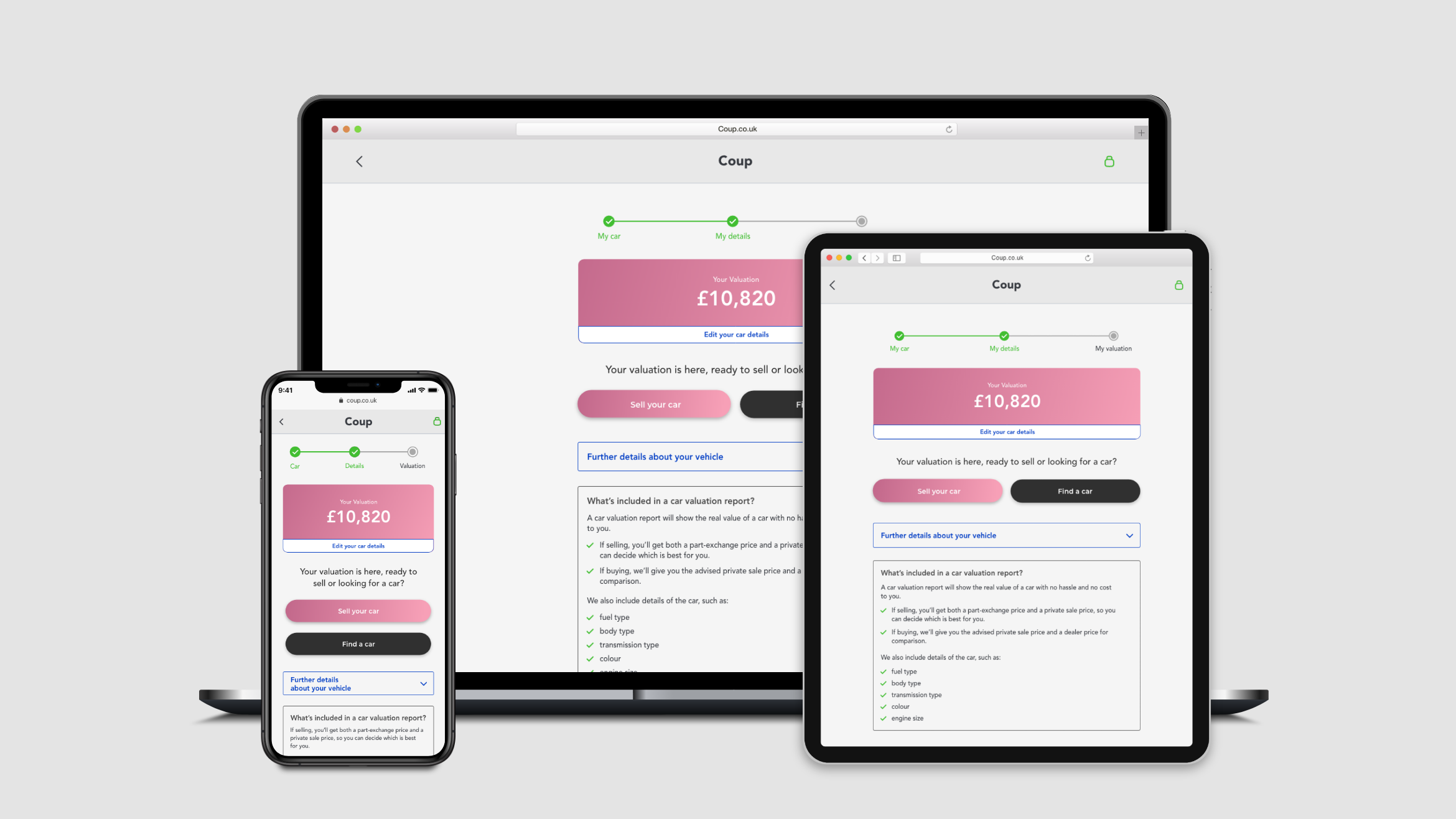
Features implemented
Progress bar - shows how many stages there are and how many are left.
Indication how long the process will take.
Edit feature inside valuation box - clearly shows users where to edit their car details to update their valuation.
Two CTA buttons - to guide users to sell their car and to guide users to view the cars we have for sale.
A ‘further details about your vehicle’ accordion and to move under the two CTAs
Don’t show the booking an appointment feature until ‘Sell your car’ CTA button has been selected.
Desktop should be the same as mobile with one central column and the same button functionality.
Key Learnings
Importance of Communication
Communication is an important part of good design and no matter how amazing the product is, if people can't use it then they will simply leave or stop using it. The challenge is to use human-centred design to create great results and make the feature easier to find and use for a more enjoyable user experience. The main objective is to make the feature searchable, successful and that customers won't have to think and return back to the site.


